Every Thursday I will be trying to take a few minutes out from work to bring you snippets of information under the rather catchy heading "Tech Talk Thursdays".
This week's snippet focusses on a word I have been guilty of throwing around a lot lately!
"Responsive"
(what on earth is he talking about?!)
Since the dawn of the iPhone and subsequently the smart phone, tablets and all manner of portable smart device, responsive design has become a must. In the not so distant past, websites only needed to be viewed on a computer screen. Designers and developers could be fairly sure that everyone would be using a screen, a keyboard and a mouse to browse their website.
Life was easy! For instance you could react to things like when a mouse hovered over a link by maybe changing the colour of the link?
Then this happened.
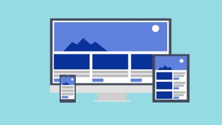
New screen sizes, interacting via a touchscreen rather than via a mouse and keyboard meant things had to change.
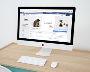
This is where responsive design comes into play. Responsive design rearranges a webpage based on the size of the screen. This ensures that whether a visitor to your site is using a laptop, computer, iPad, Android tablet or some futuristic display yet to be invented, your website will display perfectly keeping your user happy!
Talk to you next Thursday.
TL;DR: New blog "Tech Talk Thursdays", responsive design, whether using a phone, tablet or screen your website will look great.